
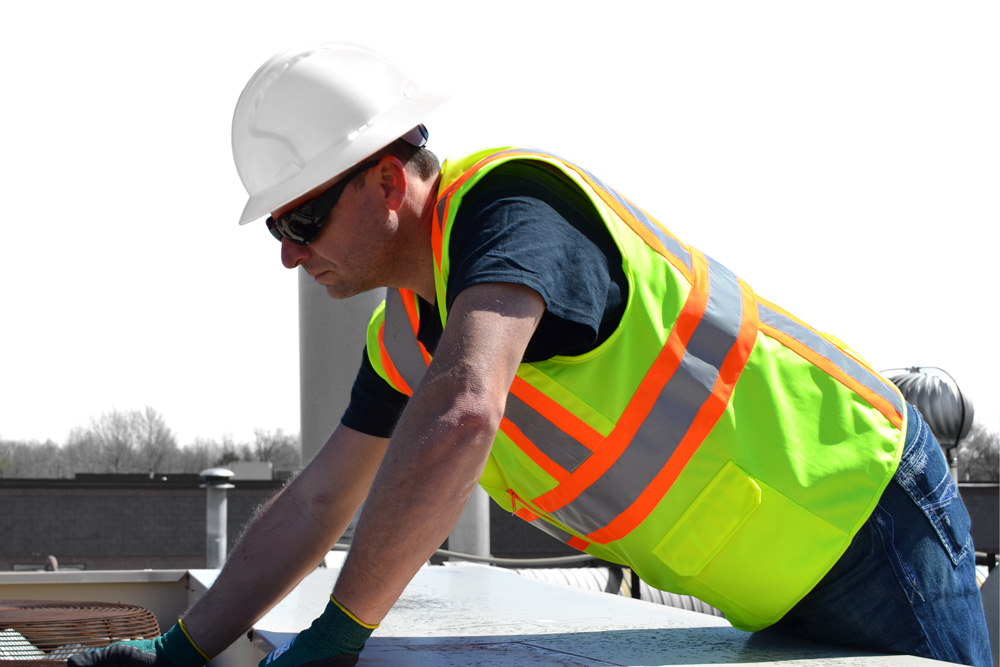
Hi-Vis clothing has become an industry ‘norm’ throughout most of the world. Anyone ‘on the job’ is expected and required to wear it to ensure that you’re as safe as possible when working among common hazards, including high-speed traffic and heavy machinery. The American National Standards Institute (ANSI) and the International Safety Equipment Association (ISEA) have set forth some important guidelines in high visibility apparel as part of the ANSI 107/ISEA 107 standard. The two accepted colors of high visibility apparel are fluorescent green-yellow and fluorescent orange.
The selection of colors:
If you want to use which colored safety is the best for you, you need a deeper understanding of some factors which I have mentioned below:
Conspicuity
The term conspicuity refers to the ability of the object’s color to come to the direct notice of the observers. This is especially important in complex environments with competing objects – for example, a crew working on a utility pole at a busy urban cross street or a First Responder on scene at a highway accident. Drivers have so many objects competing for their attention during their daily drive: how do we ensure workers adjacent to the roadway are noticed?
We make them conspicuous through contrast and recognition.
If you’re working in a construction zone, everything around you might be orange (e.g. cones and barrels). You may want to opt for a yellow jacket in this scenario. When you differentiate the color it helps you stand out better.
Conversely, if you’re on a roadside and you’re near grass, you may want an orange jacket. The yellow may blend in with the grass.
Contrast for Detection
Detection can be achieved by using a fluorescent color against a contrasting background. Contrast may also be achieved by combining “high contrast” colors in one garment. For instance, using black and fluorescent yellow in high visibility PPE creates a sharp contrast that may be more noticeable in competing backgrounds. Equisafety always puts a contrast color against its high-vis color to ensure the rider stands out even more. Yellow is predominately used to get attention, such as a yellow sign with black text or an accent.
Human eyes are built to be most sensitive to that wavelength of light (~550 nanometres), at least during the day. But when the sun begins to set and light starts to dwindle, your perception of color starts to change. So, be conspicuous at all times – consider where you are, what you’re doing, and the weather conditions when choosing your hi-viz jacket color.
Those few seconds that the fluorescent material gives to the driver to enable them to brake or swerve might mean the difference between life or death, or at least serious injury, for you and/or your horse. Fluorescent colors, plus accents of reflective fabric, are vital for times like sunrise and dusk when the light conditions are changing rapidly, and the visibility will be off.
Which Color Provides the Best Protection?
There is really not much difference when it comes to what color hi-vis should I wear. What you should note is what color your workplace recommends. Conspicuity is a combination of detection and recognition. When purchasing protective apparel for workers that are exposed to visibility hazards – whether standard hi-vis workwear or FR hi-vis – keep the job site environment and current visibility regulations in mind. In contrast to detection, Also, Purchasing a high visibility vest is a wise investment for the future, to stay protected and safe. So, be sure to choose a quality hi-vis vest made from durable materials. In this case, you will be able to use it for a longer time.